
Implementing a fuck-you Trump in collage form
Collage Web Art & Resistance: The New Pain Propaganda (Sorta)
Say hello to the (only slightly new) Pain Propaganda!
This redesign was a fairly minor one; The core wrapper is mostly the same, with some adjustments to typography, a minor tweak to the brand colors, and a major fucking change to the homepage hero.
Additionally, I've begun moving my print-on-demand merch (aside from art prints) over to a new print service that integrates with my Etsy shop; I've also removed some old designs that just didn't have the interest needed to keep them up.
Anyway, let's talk about the redesign.
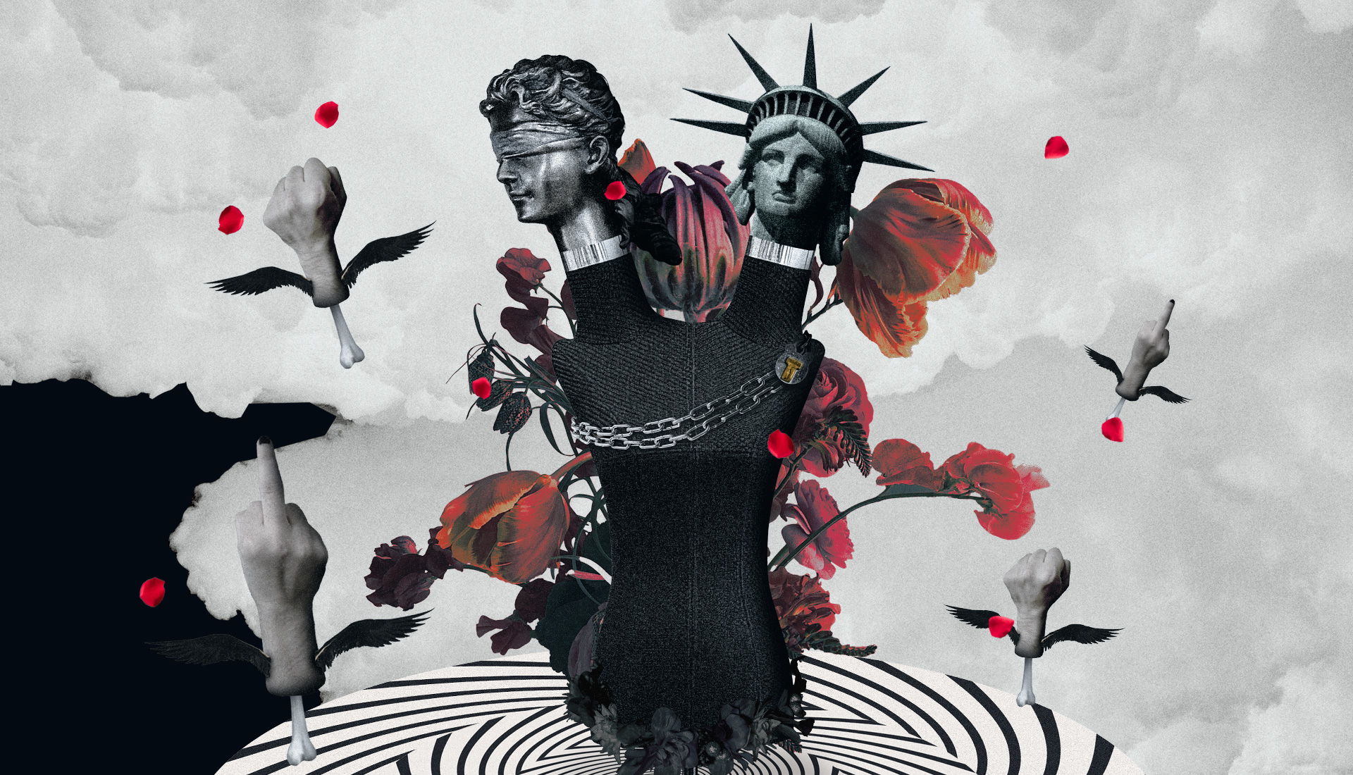
The crazy animated dark-as-fuck collage
If you haven't checked out the homepage hero yet, please do so now.. Especially if you're on a desktop, as you get to see more of the assets just by nature of the larger screen (although I obviously built it with mobile as a close-to-second-best option given how the world works).
This piece was conceived - as much of my art lately has been - as a big ole' fuck you to Donald Trump and the current administration.. And yes, the first deployment of it being on the 4th of July is intentional.
Justice, Lady Liberty, death, and the chains of bondage clasped by Trump's brand atop the hypnotism of fascism guiding his base towards darkness. Blood falls in the form of rose petals; the most beautiful aspects of what makes America (a nation of immigrants and disenfranchised folks) being sacrificed and forgotten as they fall, as if they never existed..
..And flanking it is the resistance: Those of us raising our fist and giving the finger to the fascists in charge.
I have - in the past - tended towards more open interpretation in my art, but this one isn't really as open. Sure, you may see some additional things in there, but the core message - Trump is an authoritarian fascist who is actively harming America - will always be there.
The production of the design took just a couple days of brainstorming and actual design work; Coding took a bit longer, which we'll talk about a little later in the technical section.
The hardest part, honestly, was the typography: I wanted to get away from using Adobe fonts in my work so I could (eventually) ditch my Creative Cloud subscription entirely. The serif font style I wanted to use for headings, however, was.. Not easily found.
Sure, I could use New Spirit, which Adobe has licensed for Adobe Fonts, but again, I'm trying to ditch Adobe.. Even though it's literally perfect.
I spent numerous hours over multiple days testing alternative fonts, trying to find something that worked. I even tried some sans-serif display fonts, and almost settled on something, but I still fucking hated it.
Eventually, I found a font with a reasonable web license that was affordable: Aveburg Grande by Shapespired Design. It's condensed, has that rounded heavy weight style, and was well-designed with accurate and consistent baselines on the web font files.. Which, unfortunately, can be hard to find. I'll probably be writing something up about that later.
Since we're already talking some technical details, let's talk about the code, shall we?
The code of my animated collage design (and a big fuck-you to Apple)
First off: Seriously, fuck Apple. Safari is a dumpster fire of a browser that still fails to adhere to proper specs or have consistency in rendering.
In this case, my biggest gripes are in z-indexing, transforms, and focus-within.
Let's talk about focus-within first.
You see, my navigation - which is the same navigation code of the previous design - relied on the focus-within CSS pseudo-selector to show the navigation. This was a seemingly elegant solution to creating an accessible and performant modal navigation that didn't rely on any JavaScript.
Except it apparently didn't work in Safari with my implementation.. Which was nothing special at all. A simple button that should capture focus when clicked - as per the goddamned standard - wouldn't. Even switching it to an anchor or (shudder) div (with taborder applied) wouldn't work.
So, that's a big ole fuck you #1 to Apple there.
Number 2 and 3 are part of the same issue: Z-indexes and transforms.. And this is a long-running issue, so we're going to keep the bitching short here.
Safari can't seem to understand z-index at all when transforms are applied.. And even when they aren't, in some cases.. And if you apply nested transforms (transforming the parent plus multiple children separately), be prepared for a big ole' what the fuck Safari, are you drunk? reaction. Those spinners at the bottom of the design? Yeah, weird shit happens on iOS.
Note that I said iOS and not just Safari: I say that because, just to remind everybody, Apple is allowed to be a monopoly and not allow any web rendering engine to run on iOS except their own.. So it doesn't matter if you use Chrome, Firefox, or any other browser under the sun: You're basically using a re-skinned Safari here folks.
Now that the bitching is done, let's talk briefly about the actual code here.
First off: I upgraded from Tailwind 3.x to 4.x. I did this so I had more access to transforms, which 3.x was lacking on.
Speaking of which, all of the animation code is done via CSS. The only JavaScript here is to toggle a class on body for when the nav button is clicked (again, fuck you Safari). This can get a little complex to manage with Tailwind vs. something like SASS, but Tailwind 4.x is better overall in this case in my opinion.
Otherwise, we're sticking with the Next.js implementation I've had for a while now. I still run the build process locally and just upload to my server manually, because fuck off trying to upsell me on Vercel. I have nothing here truly requiring a dynamic generation on the server-side; The rose petals are dynamically positioned on build, but that's just like the pillars on the previous design (and I always like seeing how it changes on each build anyway).
That's pretty much it. Happy 4th, and Foxtrot Delta Tango!