The 2024 Pain Propaganda redesign
I love glitch art.
I have for a very long time, and have done many pieces based on common glitch themes (I've been partial to pixelation and color offsets).
Hell, even my digital photography has been influenced by an analog "glitch" style known os lomography.
With the advent of AI - and the fact that I keep seeing Rob Sheridan's work popping up in front of me - I decided to create something a little different than my past glitch art styles.
The core themes of the 2024 redesign of Pain Propaganda is AI hallucination, and how it reaches that process.
You see, computers have operated on a very simple concept ever since they were first invented: Flowing electrical current, or not.
Think of it like a fork in the road.. Except once you pick left or right - flow current or not - you then get left to another fork, and another, and another.. Which is what forms the entire logical structure of modern computing, essentially.
Switches on, switches off.
It's amazing that something so simple has ended up being a part of one of the most controversial technological advancements of our time: AI.
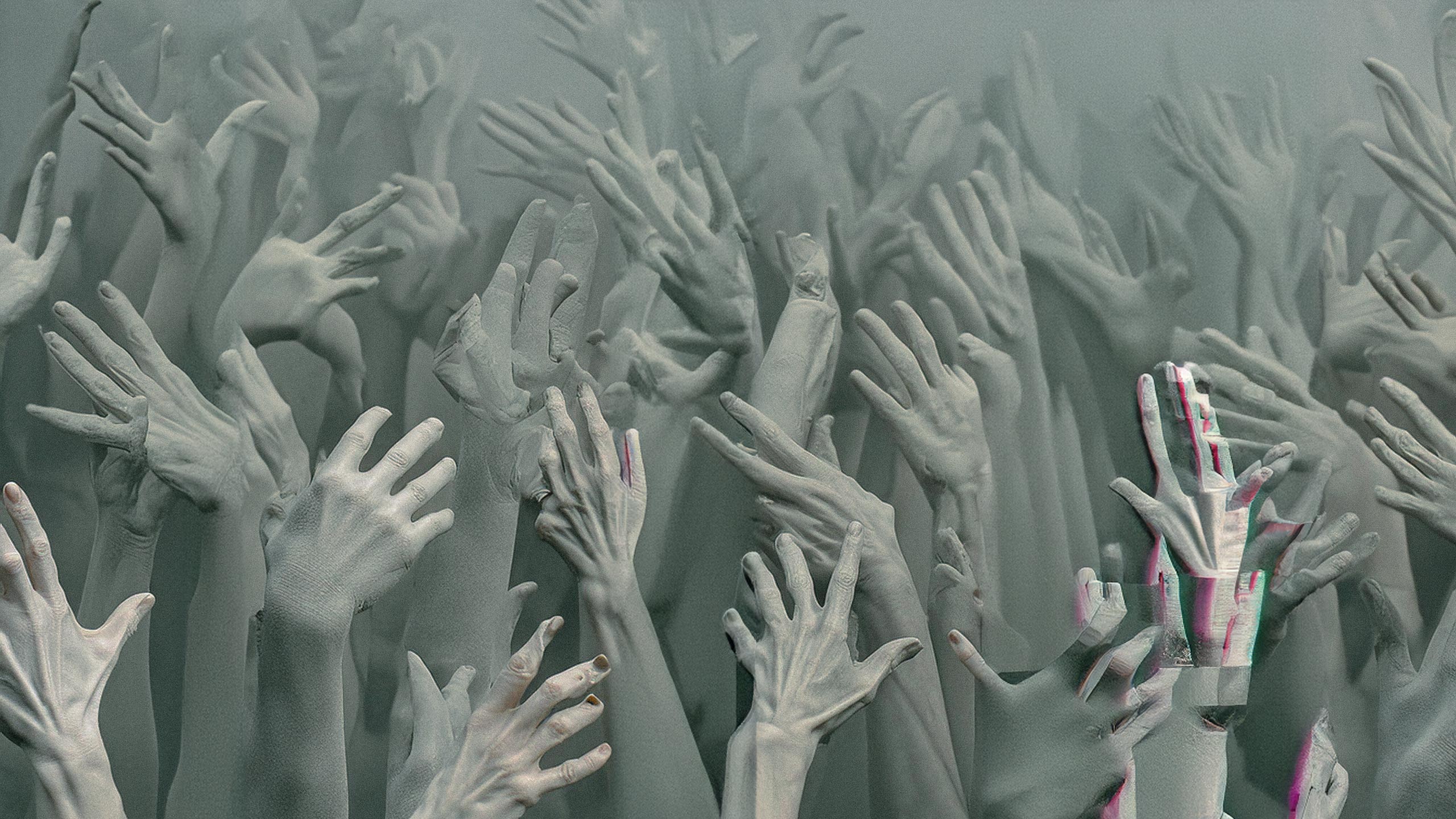
I love how bad AI is at hands. It's amusing to me as an artist; Whether working in traditional media or digital, I've always hated drawing/painting hands (and faces to a lesser extent, which AI can also struggle with).
Hands are one of the more challenging parts of the human body to create in art, despite most of us having them right in front of us as we create (I didn't forget my fellow mobility-limited artists).
So, with the hero design on the homepage, I set about utilizing AI to generate a crap-ton of weird-as-fuck hands. Not a single hand in the entire hero is anatomically correct. Every. Single. One. Sucks.
This is harder than it used to be when AI image models first came out.
Once I got that done, I did a bit of post-processing work, and set about to performing some additional glitching (because of course I had to have some color offset in the art).
The rest of the design's theme is all about foundations.
The 3 rotating symbols in the middle represent the internal process that drives computing.. + for flowing current, x for not, and the constant shift of these switches to produce what you see.
The re-conceptualized "W" brandmark is another foundational aspect of me as an artist: When I first began creating art in traditional media, I'd start by drawing a line.. And then another, and another, until I saw someting in the random scribbles and began to develop it properly.
If you've ever watched an AI image generator work, it's not too far off from a similar concept: It starts with noise, slowly reshaping it into a (hopefully) cohesive image.
The final foundational concept is the use of space.
The previous Pain Propaganda design was a little more tight; It was designed to feel almost suffocating, high-contrast and brutalist, representing the struggles of chronic pain.
This design instead focuses on guiding you via breathing room and subtle queues.
This actually isn't the first time I've focused on foundational aspects in creation; It's actually a recurring theme for me, and something I enjoy coming back to time and time again.
If you haven't yet, don't forget to read the companion post about getting educated and involved in the ethics of AI.